Amel (Founder & Photography)
Silvana Sari (Creative Direction & Graphic Design)
Conceived in a rural village of Fakfak, West Papua, Indonesia, Henggi is a handmade skincare brand. It is the first of its kind to use the village specialty product: Nutmeg. Inspired by the owner's passion and vision for the brand, and as a fellow native, my team and I was propelled to support the business pro bono by creating naming and brand identity that would enables the brand’s story to soar even further into a wider market.


Henggi means nutmeg in the native language of Fakfak, a rural village in West Papua. The name reflects the core value of the brand: staying grounded in its origin and honoring its humble beginnings as a homemade product crafted by a passionate Indigenous artisan with a long-term vision.
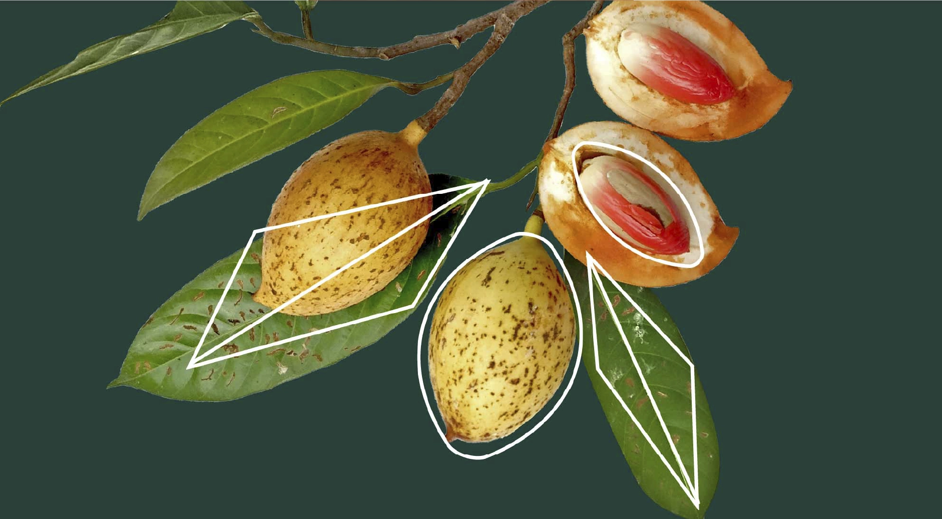
Conceived in Fakfak, Henggi is derived from the village’s primary agricultural specialty: Papua nutmeg. Compared to other varieties, Papua nutmeg has a higher fat content with a naturally buttery texture, larger fruit size, a longer and sharper form, and a higher concentration of trimyristin, an essential compound for cosmetics, soaps, balms, and lubricants.
Armed with knowledge gained from a small business workshop and a desire to elevate the economic value of her birth village, the founder of Henggi began producing nutmeg-based soap and balm products. Recognizing the strength of this story and potential for growth, my team and I—sharing a cultural connection to the region—supported the founder by developing a name, brand identity, and packaging system that could carry Henggi into broader local and international markets without losing its cultural integrity.
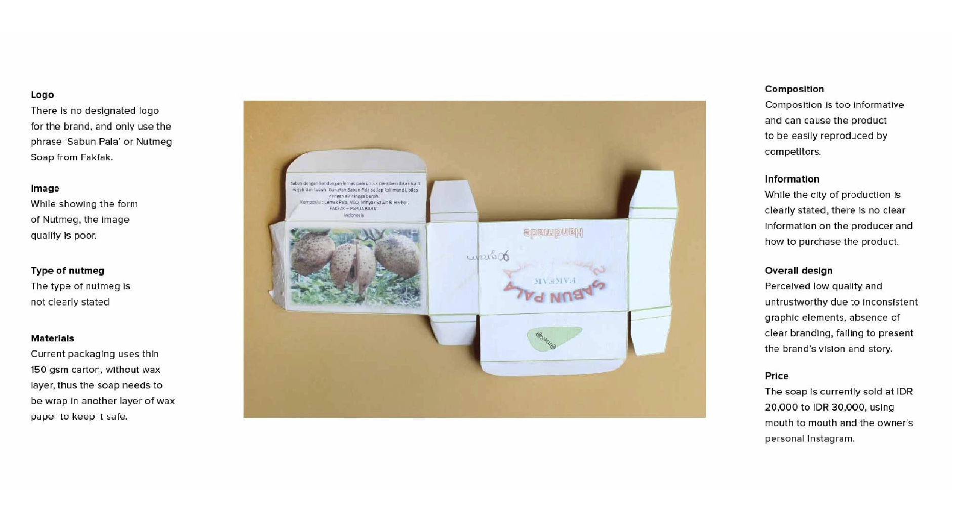
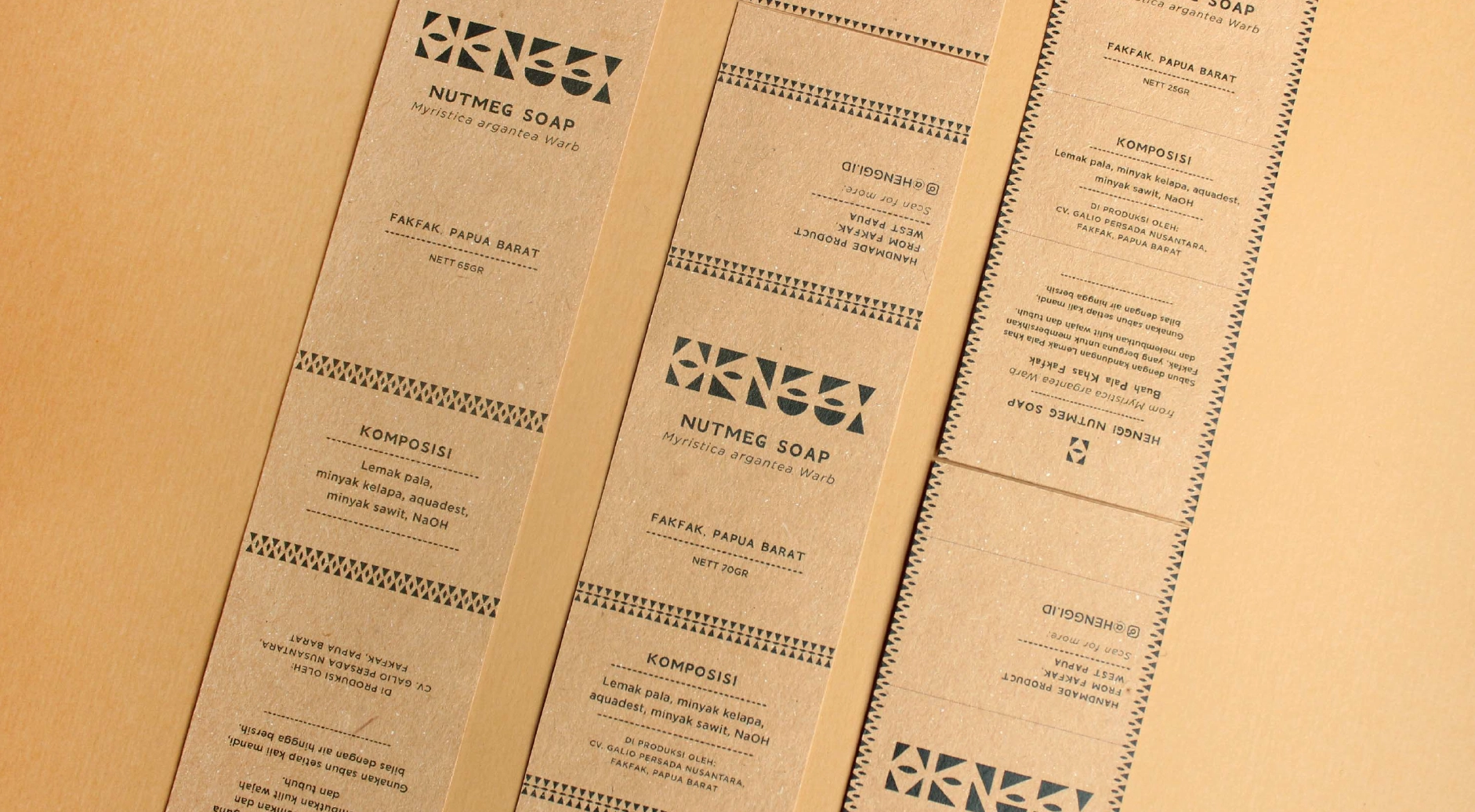
The initial product packaging was functional but limited in scalability, brand recognition, and visual consistency. This review phase helped identify opportunities to improve legibility, storytelling, and production efficiency while remaining aligned with the realities of small-scale, home-based manufacturing. The product carried no formal brand identity, only the descriptor “Nutmeg Product from Fakfak”, and was sold primarily through traditional markets and word of mouth.
Demographic
Geographic
Psychographic / Use Cases
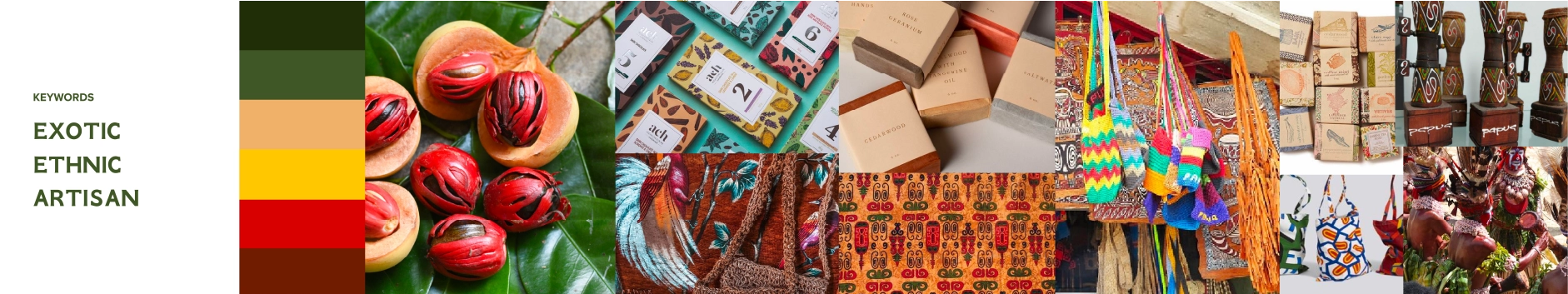
Benchmark references were drawn from brands that emphasize handcrafted authenticity, alongside those that employ bold color palettes and memorable visual systems. The intent was to create a brand that stands out visually while remaining honest to its roots as a handmade product from a small Papuan village.
The stylescape establishes a clear visual direction inspired by:
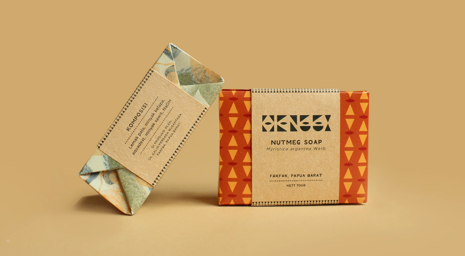
A guiding cultural reference comes from a Fakfak proverb: “lighting a pot with three stones,” symbolizing unity among different tribes within the village. This philosophy, many parts forming one stable system, informed the identity’s modular logic. While Henggi initially launched with a single soap product, the founder envisioned future nutmeg-based skincare and wellness lines, requiring an identity capable of scaling without redesign.
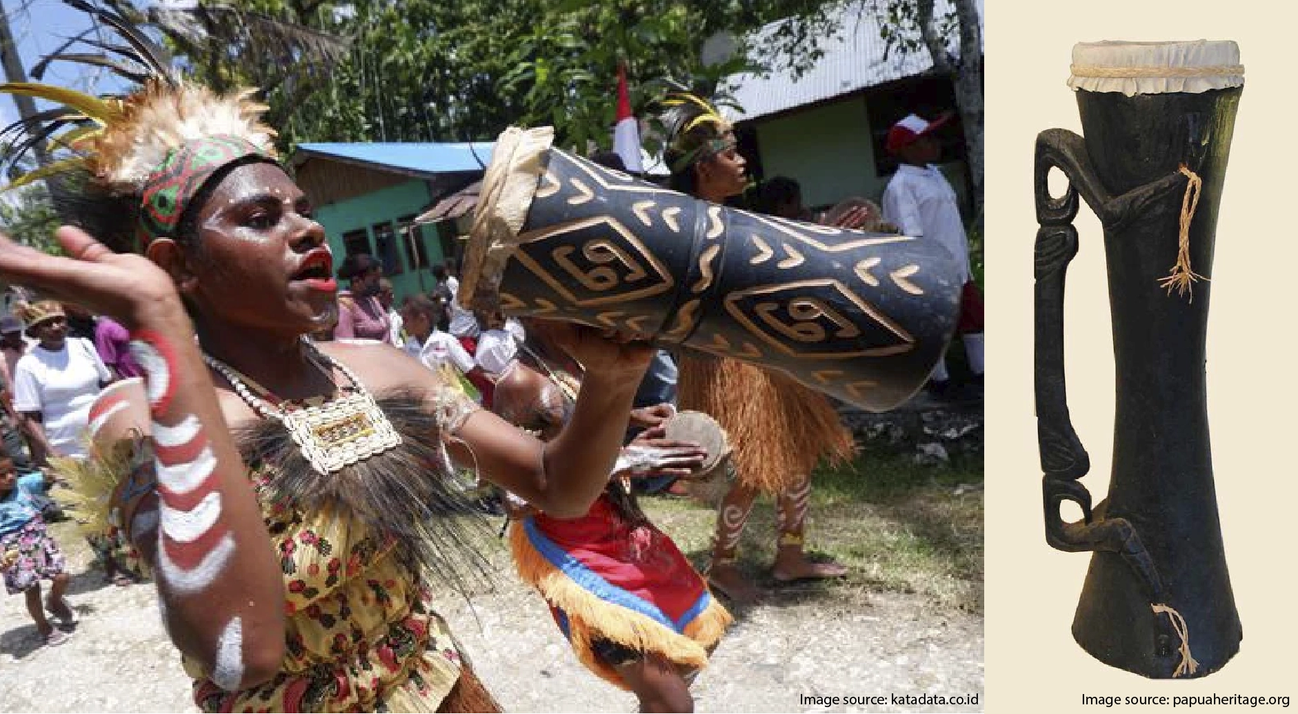
The identity design draws from both material culture and social systems in Fakfak. Two primary sources informed the logo’s form:
Together, these references informed a visual language rooted in function, meaning, and cultural continuity, intentionally diverging from the minimalist aesthetic common among handmade soap brands in Indonesia at the time.
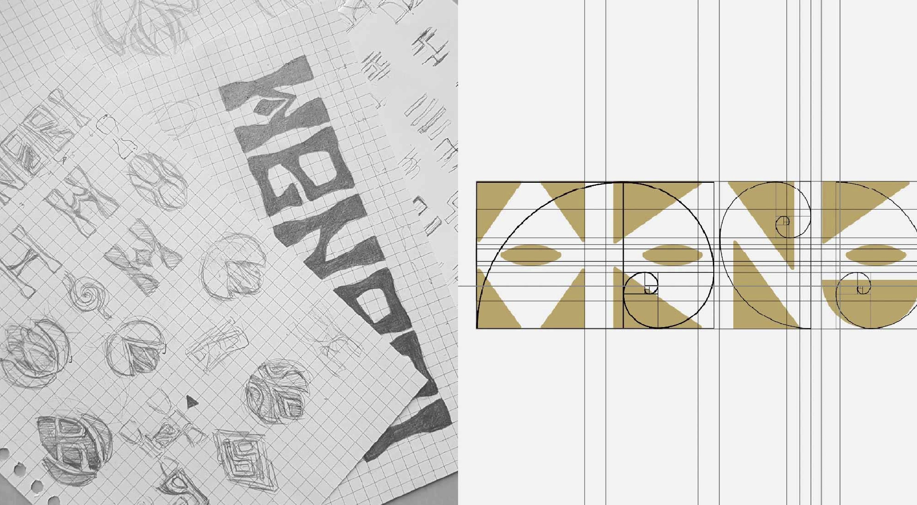
Rather than treating the logo as a fixed symbol, it was designed as a modular system. The geometric components can function independently or combine into a unified mark, depending on context and scale.
From a UX and systems-thinking perspective, this modularity serves several purposes:
Conceptually, this mirrors the nutmeg itself, each part useful on its own yet inseparable from the whole, and reflects Fakfak’s cultural philosophy of interdependence within community systems.

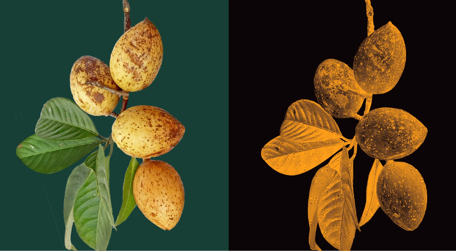
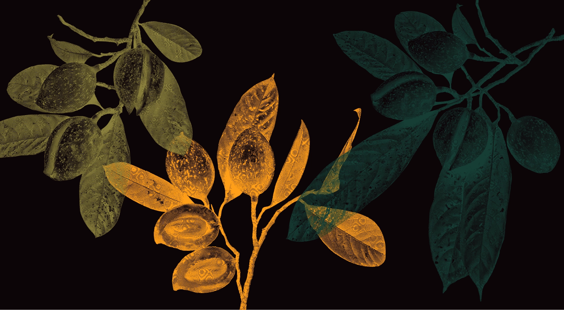
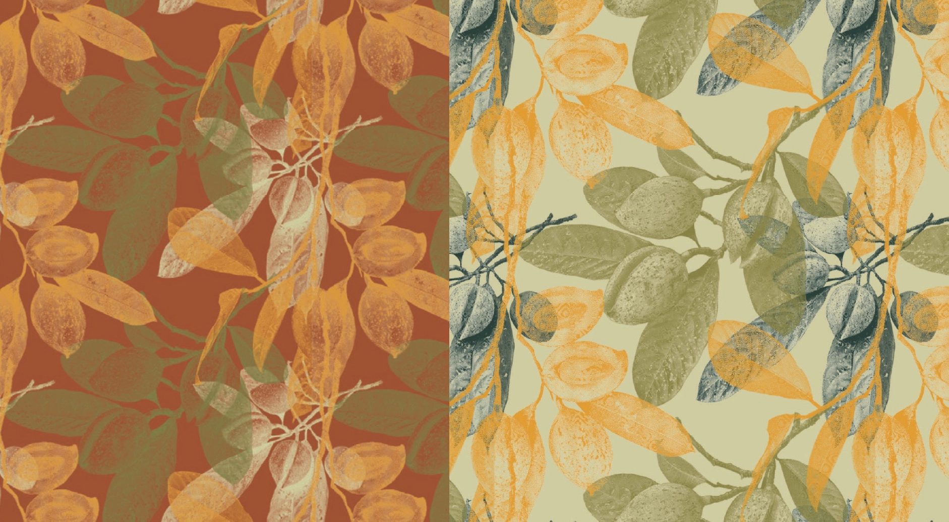
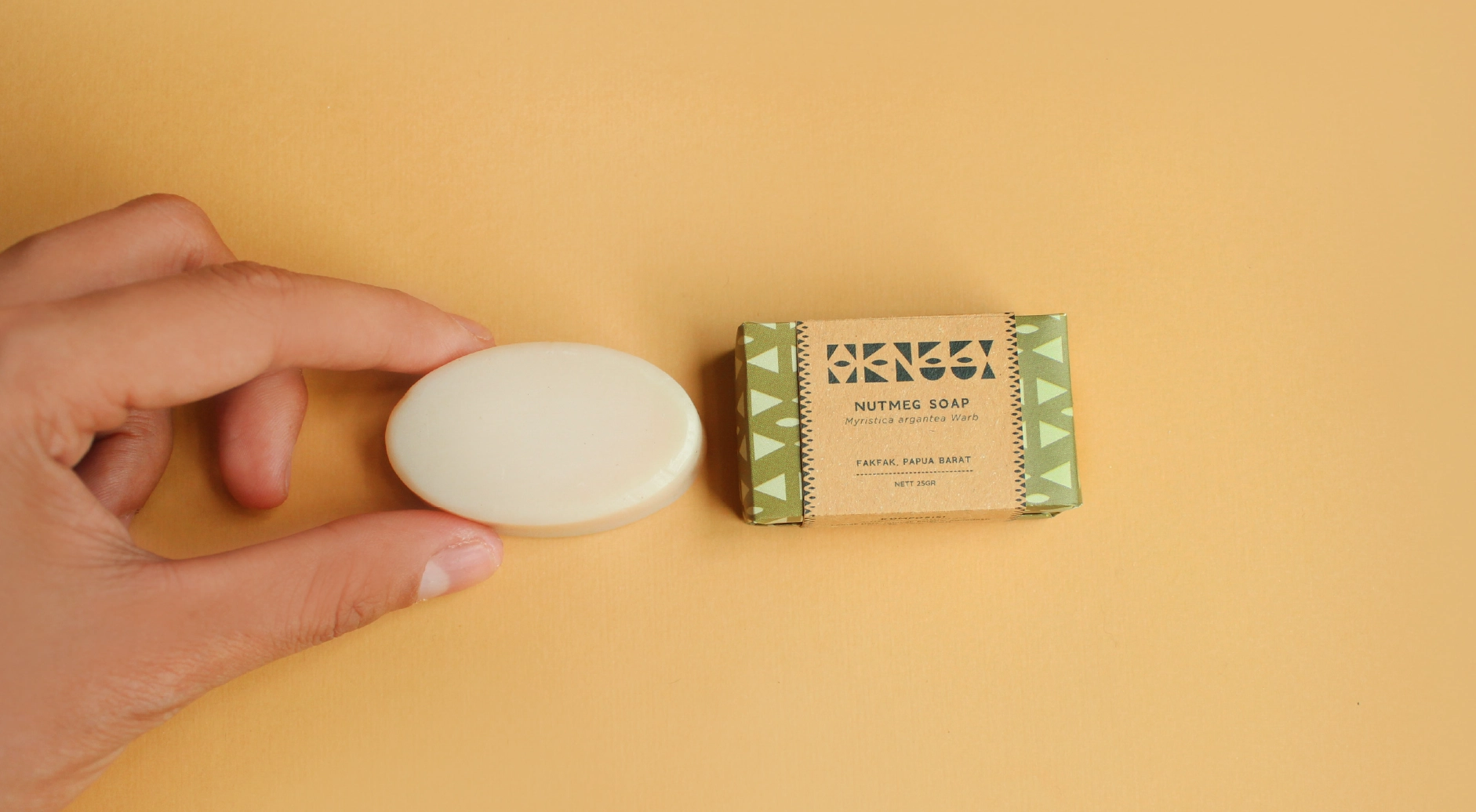
Supporting graphic elements include custom raster illustrations of nutmeg fruits, developed from photographs taken by the founder. These assets extend the identity system rather than decorate it, allowing for variation in scale, colour, and density while maintaining coherence.
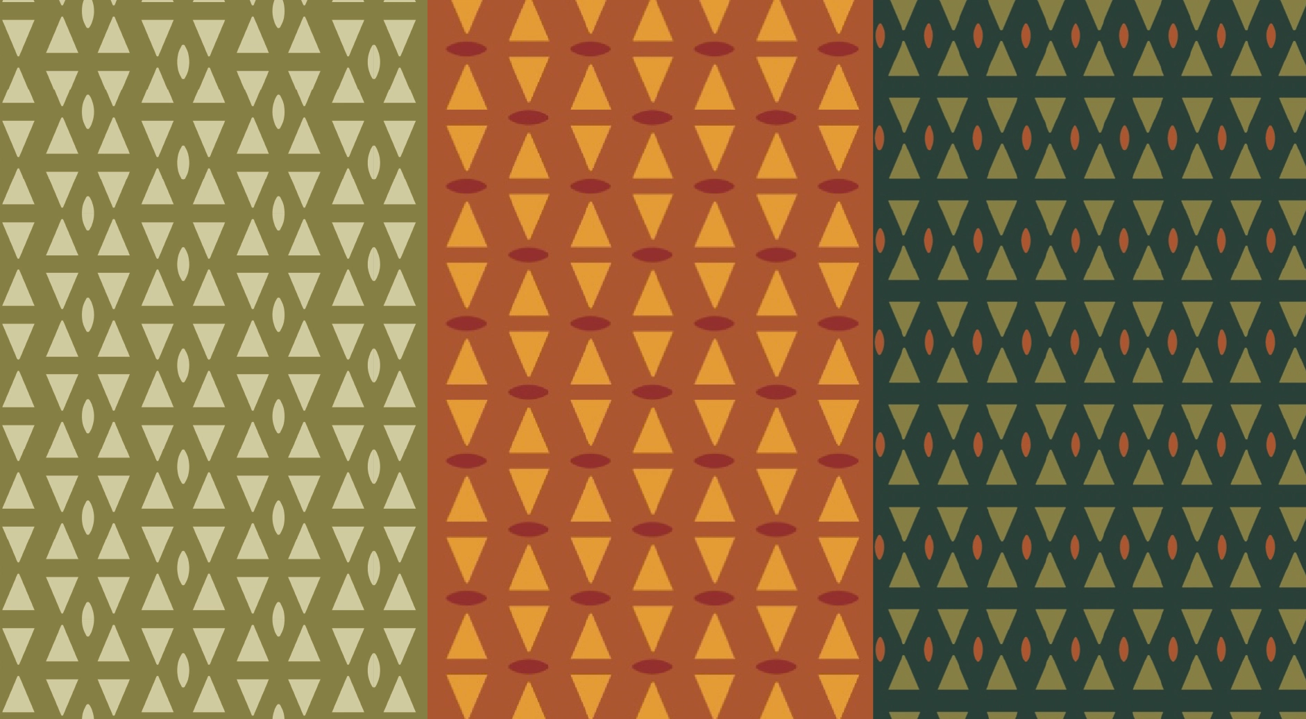
The logo’s modular geometry enables the emergence of multiple patterns from a single visual language. For the initial launch, we developed:
These patterns serve both aesthetic and functional roles:
Packaging design was approached as a constraint-driven system, shaped by the realities of rural, small-scale production.
Key considerations included:
These decisions ensure that the packaging system is not only visually coherent, but also operationally sustainable, enabling the founder to manage production independently or with minimal support in a home setting.

The resulting brand system balances cultural storytelling, functional design, and long-term scalability. By treating identity and packaging as interconnected systems, rather than isolated visual artifacts, the Henggi brand is positioned to grow organically while remaining rooted in its place, people, and purpose.